The main project of the course UX1400 - Foundations of User Experience is this digital portfolio that is being viewed. The intention of this project is to use the knowledge and skills of UX principles to create a digital portfolio.
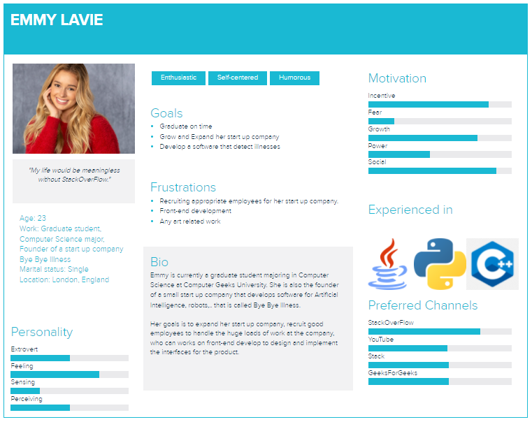
A personas of an Computer Science major college student and also a founder/recruiter that I categorized as expert who knows a lot about the technology or my profession.
I decided to have a sticky navigation bar that stays at the same spot while scrolling so that the viewer doesn’t have to scroll up to the top to navigate to pages. I chose light blue-green, black and white to be the color scheme for my site. The reason is because the light green-blue elements and white text would be stand out on a black background, and this is also the color scheme I used for my resume, which I thought having them matching would be great. I also decided to have a form for the user to fill in their email and message they would like to send me to connect. This method is used instead of listing out my information since it would be a duplication with my resume. This form would be more creative and convenient to the user to just connect with me directly.
My targeted viewer is primarily the potential employers. Therefore, I made personas of potential employers, including different categories. For instance, the viewer could be someone who knows a lot about technology or could be someone who doesn’t, like a recruiter or other general viewers. By doing this, I am able to determine the content that my targeted viewers want to see and how I can apparently show them these information without making it hard for them with thinking and navigating.
I learnt a lot about the Law of Usability and basic concept of User Experience, such as the process of design thinking, how to catch viewers’ attention, how I could apply these into designing my portfolio. In more detail, I found the Law of Usability - Don't make me think is very interesting and worth to learn about. This led me to read through the book Don't make me think, written by Steve Krug. This book emphasizes the key points for the usability of websites and mobile applications, in which the idea is to create designs with which the users don't have to think too much about how the interface works.
I used to have a thought that User Experience is just all about designing a graphical interface that looks good. I realized that I was technically wrong, and my thoughts change as I take this course. User Experience is not only about designing and make something look good, but also about centering the users, giving them the best experience with both the look and the feelings.
This course inspires me to dive a little deeper
into front-end, interfaces designing and experiencing. This motivates me to be a better full
stack developer as I now have the knowledge on how to give the users the best experience
using the product I create. By taking this course, I also stepped out of my comfort zone. I
used to be someone who cannot create any effective graphical interface without template.
This course does not give the solution, or the template right away, but I learn how to
approach and clearly determine the problem to come up with my own solution or template with
the design thinking process.
Krug, S. (2019).
Don't make me think, revisited: A common sense approach to web usability.
New Riders.